
Ingenious Results is a software, web, mobile and cloud engineering company and a Microsoft Dynamics 365 partner, serving clients across North America from offices in seven US cities. Its offering spans CRM and ERP, the Power Platform, managed cloud and security services, AI and government contracting.
With that much breadth, the risk is a website that lists everything and explains nothing. Ingenious Results needed a site where a hospital CIO, a public-sector buyer and an ecommerce founder could each find their way in seconds, and leave confident they had found a serious partner.
The decision
We led with user experience before visuals. Instead of organising the site around the company’s internal structure, we organised it around the questions visitors arrive with: “Do I need a cloud solution?”, “Do I need IT consulting?”, “Do you work in my industry?”. Every section answers one of those questions and offers one clear next step, while the full depth of services stays one click away in the navigation.
What we built
UX and information architecture
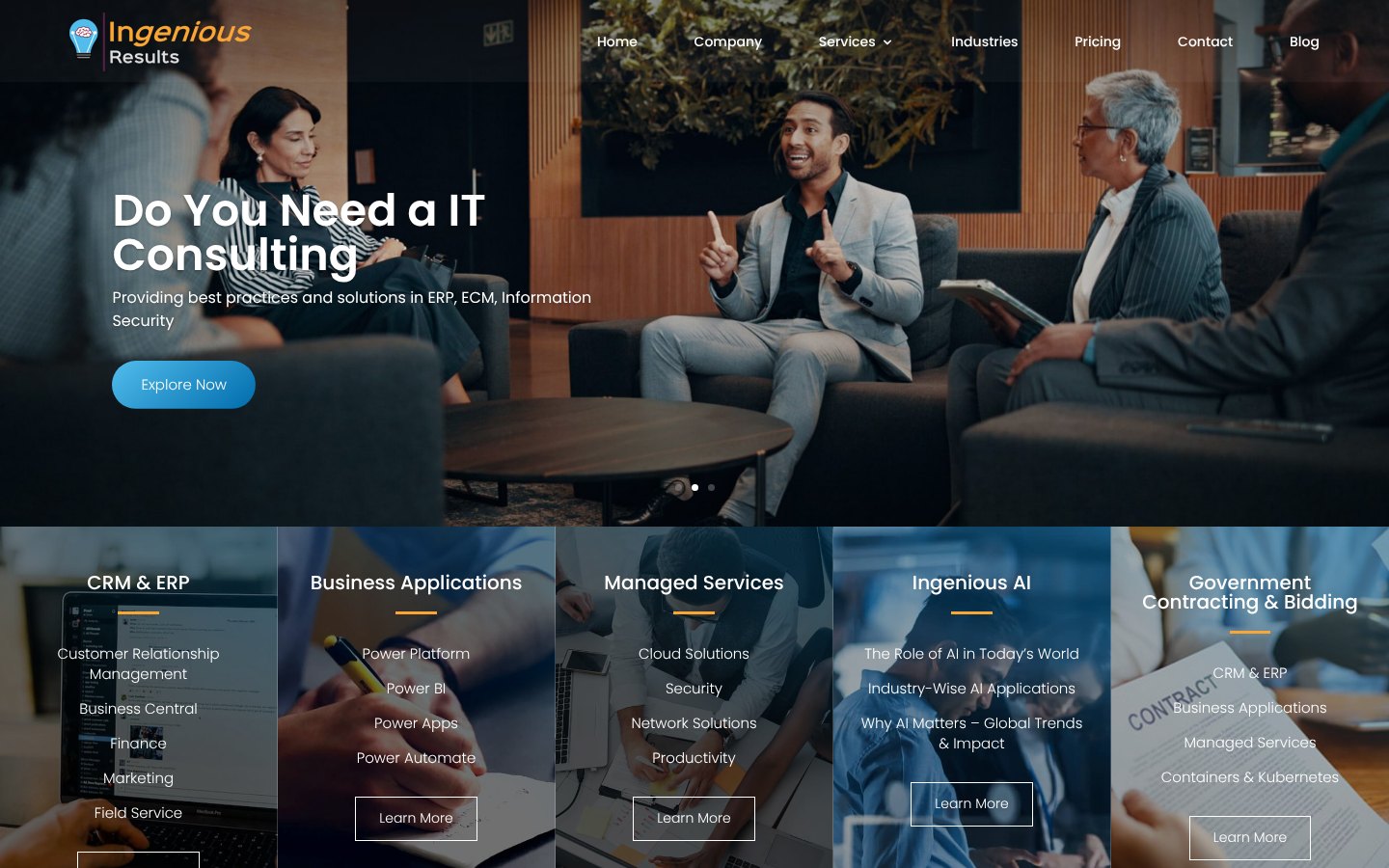
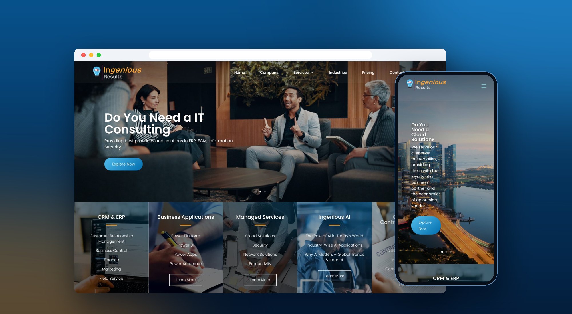
ingeniousresults.com- Question-led hero. A three-slide hero that speaks to visitor intent (cloud, IT consulting, web, mobile and enterprise resources), each with a single “Explore Now” call to action.
- Five service pillars. CRM & ERP, Business Applications, Managed Services, Ingenious AI and Government Contracting & Bidding, each with its sub-services, laid out as one scannable band directly under the hero and mirrored in the Services menu.
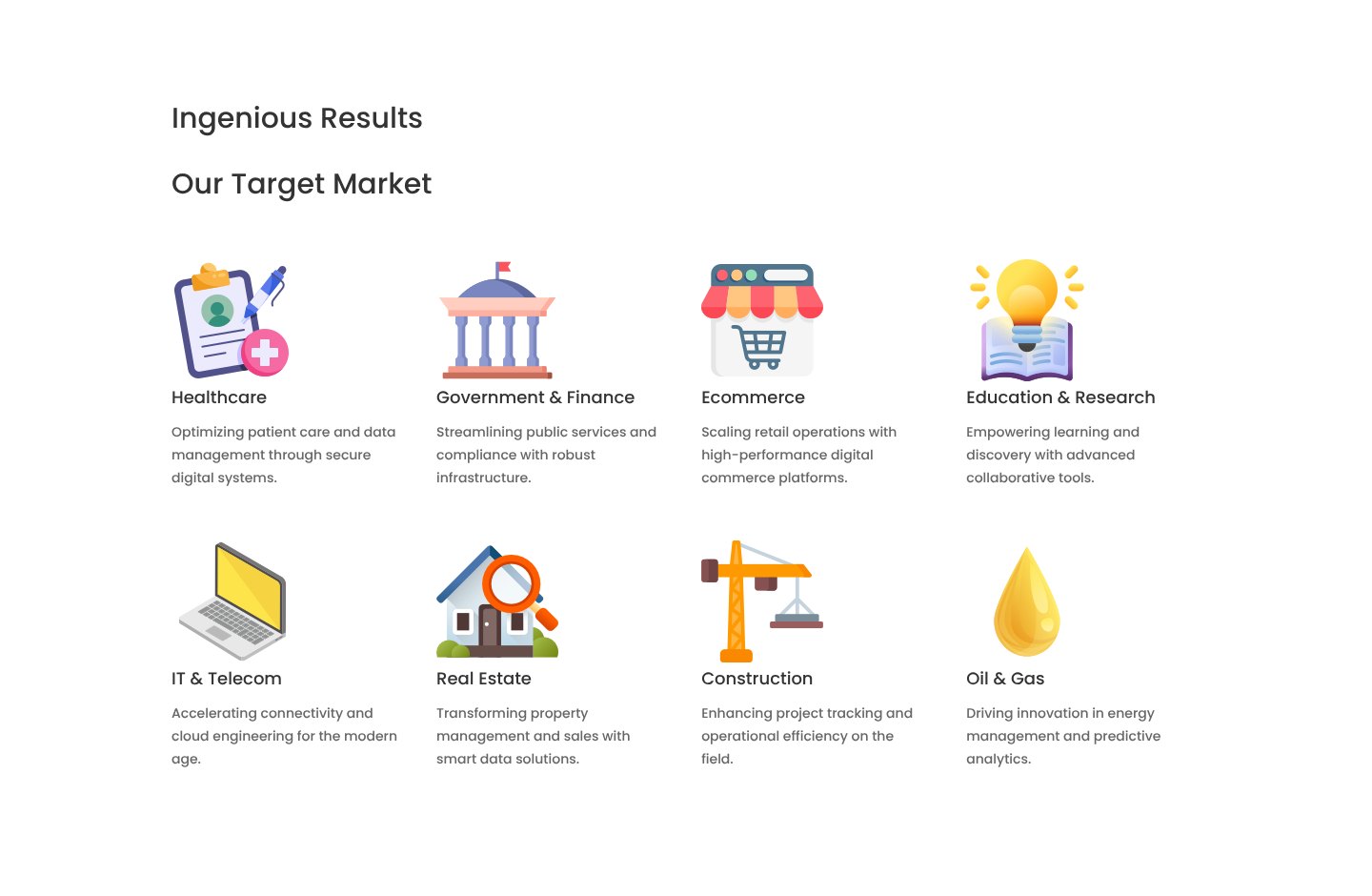
- Industry-first wayfinding. Eight target-market cards, from healthcare and government to oil and gas, so buyers can confirm relevance before reading further.
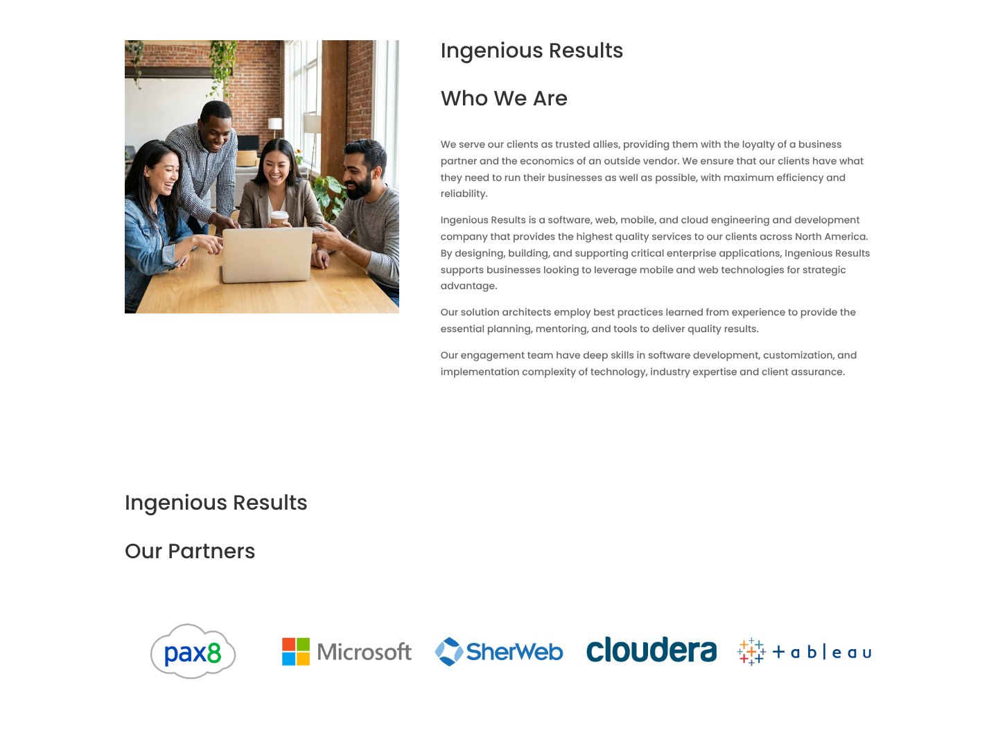
- A deliberate page rhythm. Who we are, partners, careers, industries and insights follow a sequence that builds trust step by step and ends in clear contact routes.
Visual and interface design
- Calm, confident palette. A professional blue system with a warm orange accent drawn from the lightbulb logo, used sparingly for emphasis and dividers.
- One typeface, clear hierarchy. Poppins throughout, with consistent heading scales and generous spacing so dense enterprise content stays readable.
- Image-led service tiles. Full-bleed photographic tiles with dark overlays keep five dense service lists legible and visually distinct.
- Custom industry icons. A consistent set of illustrated icons gives each of the eight industries an instantly recognisable marker.
- Trust built into the layout. A partner strip (Microsoft, Pax8, Sherweb, Cloudera, Tableau), photographed office locations and a live careers section make the company tangible.
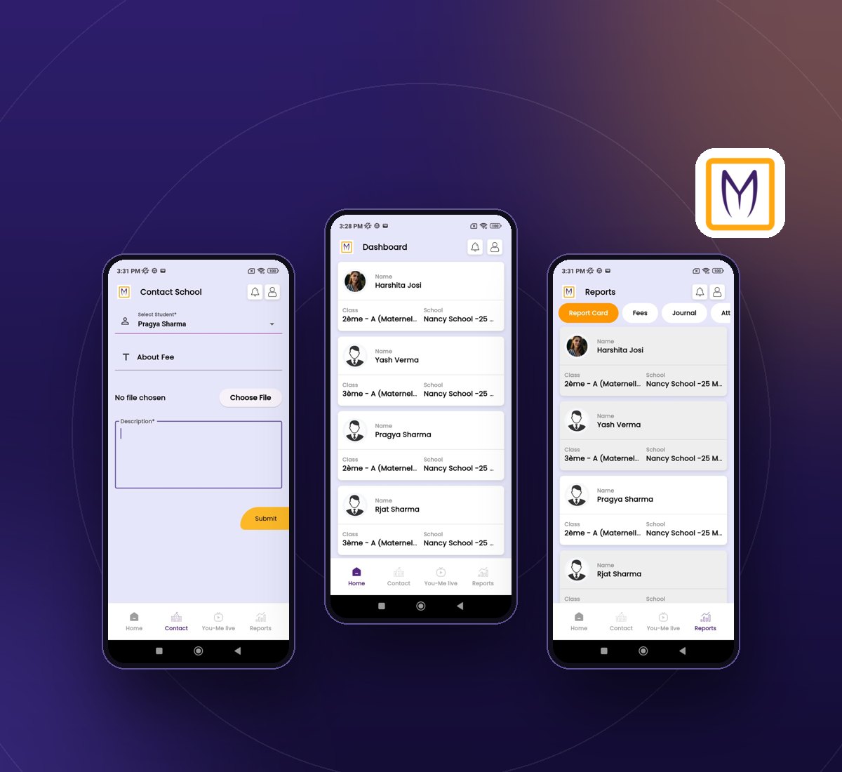
- Responsive by design. Mobile layouts with a stacked hero, a compact menu and full-width service tiles, designed alongside desktop rather than after it.